How we rebuilt Shopify’s developer docs (again)
Why we reorganized Shopify.dev information architecture around developer goals, not information type
March 2025 I recently discovered that the Shopify UX blog was shut down and its archives are no longer online. So I'm updating this post with the full text of the original article. Many of the links are to the Wayback Machine, because Shopify.dev itself has changed again since I originally wrote this.
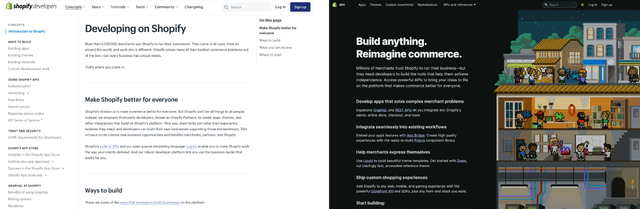
Last week we unveiled Dark Mode for Shopify.dev, the developer docs hub for the Shopify platform. But that’s just the latest in a series of major design updates we’ve made to Shopify.dev since relaunching the site at Unite.
When we first launched Shopify.dev in February 2020, I wrote about the design process that led us there as a Senior Content Designer on the team. But even back then, we knew that what we’d built was Version 1.0, and that the site would need to evolve as we observed how Shopify’s vibrant community of developers used it in the real world.
Throughout 2020, we saw some things working really well — and some that needed a rethink. So I wanted to revisit this subject to talk about some of the updates we’ve made to the site’s information architecture, and why we made them.
What needed updating?
In the original design of Shopify.dev, we sorted the site into four main content buckets:
- Concepts: Key context about the platform
- Docs: References for APIs and other key products
- Tutorials: Narrative how-to instructional content
- Tools: Software to accelerate the build process
There were lots of things we liked about this model:
- It was useful to group together high-level information about the platform in ‘Concepts’ — our quantitative and qualitative research both suggested quality user engagement with that part of the site.
- Separating Tutorials (step-by-step tasks that you need to complete) from References (comprehensive descriptions of APIs) was the right move. While these types of docs are often used in tandem, users consult them for different reasons, and a clean distinction allowed us to refine the design experience of each document type.
- Breaking out ‘Tools’ into their own standalone section made our tooling more findable and reduced duplication in other parts of the docs. For instance, App Bridge is required for a variety of development tasks on the platform. Having a single home for the library in the Tools section made it easy and consistent to link to.
But as we lived with the site over its first year in the wild, we observed some other things that didn’t work so well:
- The ‘Docs’ label was confusing. People thought of the whole site as ‘the docs’ and so a section called ‘Docs’ (the largest section by number of pages!) wasn’t very meaningful to them. We needed to refine some of the language and labels we were using.
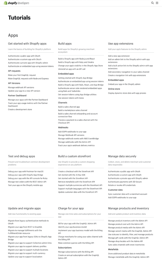
- Grouping by information type — conceptual information, tutorial information, reference information — made perfect sense on paper but didn’t work as well in practice. Tutorial content, in particular, struggled under this model, because sheer volume made it hard to do second-order navigation. If you ever landed on this page, with hundreds of individual tutorials forming a wall of text, then you felt this pain as you hunted for the particular problem you needed to solve. We experimented with a bunch of design ideas to mitigate this issue but none of them ever broke the logjam.
- Grouping by information type had a second flaw that was less obvious but became clearer over time as we talked to more developers in the community. What our users needed from us wasn’t just information, but direction. Our docs were good at describing the different parts of the platform and individual developer tasks, but we hadn’t strung them together into a clear narrative. New users arrived at the site thinking, “I just want to build a theme”, or “I just want to build an app”, and we weren’t clearly laying that process out for them. All the pieces of the puzzle were there, scattered around various parts of the site, but we hadn’t been opinionated enough about Shopify’s vision of what a great app or theme looked like.
Based on these observations, we decided our next design iteration needed to better optimize for real-world developer goals, articulate clearer narratives, and lead by example. We also recruited a small group of developers from the community — some newer to the platform, some quite experienced, and from all around the world—to validate some early design concepts. To get as close as possible to the actual experience of navigating a real website, I built a few low-fidelity versions so our pilot users could click around actual IA prototypes. (Shoutout to 11ty and Alpine.js for making it remarkably easy to build these quick-and-dirty experiments.)
Let’s dig into three specific content design decisions we made in pursuit of our goals:
- Re-orienting our main navigation from ‘information type’ to ‘developer goal’
- Strengthening our ‘Getting Started’ narratives
- Scaling up our approach to example code
From ‘information type’ to ‘developer goal’
First, we reorganized the site not by the type of information (concepts, references, tutorials), but by the developer’s goal: What are you trying to build?
Today, there are four basic “things” you can build on Shopify’s platform: Apps, Themes, Custom Storefronts, and Marketplaces. These things can overlap in some cases (and lots of developers work across categories, of course ) but in general, they’re distinct development activities.
For instance, Apps and Themes have different primary audiences. Apps are focused on extending and enhancing the platform for merchants, the millions of entrepreneurs who use Shopify to sell their products. Meanwhile, Themes are all about creating refined online shopping experiences for the tens of millions of customers who purchase things from stores running on Shopify.
Apps and Themes are also built using different technologies. Apps are web applications hosted by developers and written in any language, that interact with Shopify through a set of APIs, while Themes are collections of front-end template code, written in Liquid, that are uploaded to Shopify and run on our infrastructure. Apps and Themes have different developer tooling and design paradigms, and the developers who create them have different business models.
All of this may seem obvious — developers know, intuitively, that Apps and Themes are different things. But it was important to be crystal-clear about how we would recognize and enforce these conceptual boundaries so that this information architecture can scale with the platform. Today there are four ‘Things’ on the platform, but soon there are likely to be more, and we wanted to have some guardrails in place so our docs can grow in a way that’s orderly and predictable for everyone.
The road not taken
This way of organizing the site was not the only option we considered. A strong alternative was to sort our docs, not by the developer’s end goal, but by their stage in a typical software development lifecycle.
This would have led to a site organized similarly to Apple’s dev docs. Apple’s developer hub navigation is built around a typical developer journey:
- Discover: Exploring what’s possible on the platform
- Design: Defining the desired user experience
- Develop: Realizing that experience in code
- Distribute: Selling the final software product to end users
There’s a lot to like about this model:
- It scales well, in the sense that it can accommodate a wide diversity of software types.
- It also scales well in terms of the absolute number of types — this structure works just as well for 3 types or 300.
- It proceeds linearly through a typical developer journey, guiding the user through each phase of a successful project.
So why didn’t we take this path?
The first answer is quantitative: we simply don’t (yet!) need to accommodate the sheer scale that Apple does, supporting multiple development ecosystems around multiple hardware and software platforms. That day is coming, but it’s not here yet. (Maybe you’d like to help us get there?)
The second answer is qualitative, and it came from the many conversations we had with developer partners as we were evaluating the existing website and planning this round of design updates. Unless prompted, developers simply didn’t talk about their experience with Shopify in terms of which ‘stage of their journey’ they were in; they talked about the stuff they were building. They had no common language for ‘being in the discovery phase’ or ‘starting the distribution process’; they simply didn’t use that vocabulary. But they could always tell us — usually, with great enthusiasm — what they were building, and how those things worked together to solve merchant problems.
Ultimately, we decided this was the right evolution for the site’s information architecture: Build the Thing. Developers come to Shopify’s platform with an incredibly diverse range of needs, ambitions, experience levels, team structures, and business models. Real-world software development rarely follows a straight, tidy path. What united every developer we talked to, however, was that they had a clear vision of their end goal: to build a great app, or a gorgeous theme, or a unique custom storefront. We reasoned that organizing the site this way would help them get there faster, and keep their eyes on that horizon, regardless of the inevitable bumps in the road or detours along the way.
The exception
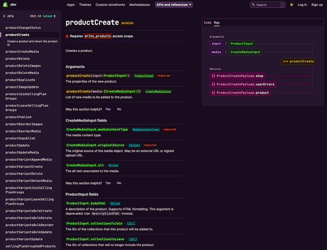
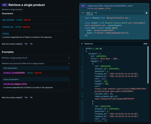
API references, such as this page for the productCreate mutation, need to support frequent use and repeat visits.
We did preserve one important division based on information type, however: API references still reside in a dedicated section of the site. By studying the usage data, as well as talking with the development community, we know that references are among the most frequently used parts of the docs. That makes sense: once you’ve worked through a tutorial a few times, you’ve probably grasped most of the basic concepts and know the steps involved. It’s not material you need to revisit much.
But a reference is something you’ll come back to repeatedly throughout your build process, regardless of your experience level. We often heard from developers that they keep the Admin API docs or the Liquid reference open in a browser tab all the time.
As a result, we wanted to ensure that references remain easily and quickly accessible from anywhere on the site. That core principle influenced a bunch of downstream design choices, such as putting the most popular references in a dropdown menu for quicker navigation, and using a shorter, memorable, and easier-to-type URL, shopify.dev/api.
Strengthening our narratives
So our first step was reorganizing the docs architecture around the end goal: build an app, a theme, or a custom storefront. It’s important to know your destination. But what about how you get there?
One of the things developers appreciate about Shopify’s platform is how flexible it is — especially when it comes to building apps. After all, most apps in our ecosystem today are web apps that get embedded in the Shopify admin. As an app developer, it’s up to you to pick your back-end programming language, user interface frameworks, and hosting infrastructure. If you really wanted to write your app in COBOL and run it on a cluster of Raspberry Pis in your basement… well, you probably could, technically! But is that actually the right choice?
In the past, we often weren’t clear enough about what Shopify considers best practice on our platform. It was like we dumped a giant box of Lego on the floor and said, “Go for it.” But we actually do have opinions about how to build for Shopify, and we’re committed to articulating that vision more clearly.
That commitment manifests in a few ways in this latest design iteration.
First, we created more ‘Getting started’ tutorials that are focused on helping you build consistent, baseline implementations. Whether you’re getting started with a minimum-viable boilerplate app, or adding power and complexity to manage product subscriptions, we’re embedding Shopify’s opinionated development paths throughout our docs in a clearer and more consistent way. The goal is that all developers should be able to create a baseline experience representing the state of the art in terms of security, privacy, and performance.
Second, we created sections devoted to literally articulating what we consider to be best practice on the platform. ‘Best practices’ are all the things that we don’t enforce programmatically through the architecture of the product, nor through human-mediated measures like the app and theme review process.
We built out new content about what Shopify considers best practices for many common development activities. The aim is to help all developers consistently build more performant, accessible, and maintainable projects.
Consider guidance like Reduce JavaScript usage. The proper amount of JavaScript for your app to load is “just enough to do what it needs to do”. We can’t tell you what that magic number of bytes is. What we can tell you is what we believe good performance looks like, so that the whole developer community has a common understanding, and merchants and their customers get more consistent, performant user experiences.
Scaling up our approach to example code
With the initial launch of Shopify.dev, we had sorted all our tutorial content into one big Tutorials section. One thing that became clear was that we had a lot of things that were called ‘tutorials’ that were really just a list of examples. Take a tutorial called Use statuses to identify, filter, and manage products. It’s a very long page but its substance is honestly pretty basic: four example API calls to query or edit a product status.
There were two reasons we wanted to cut down on this type of tutorial:
- Developers told us that the API reference was a more natural place to look for examples
- Maintainability for our internal documentation teams
We’ve heard it loud and clear from developers: good examples are the fastest way to get productive with an API, and those examples should be integrated directly into the API reference. When you’re writing code and referring to a reference doc to complete some specific task, it’s less disruptive to have example code immediately available in that browser tab, rather than having to navigate to a different part of the docs to look up an example. So maintaining that flow state and reducing context-switching for developers was a high priority.
API examples such as this one are now more comprehensive, showing requests in multiple coding languages and sample responses. Some of this content existed before, but it’s now managed in a more scalable fashion.
The second reason was scalability and maintainability for Shopify’s docs team. Those standalone example ‘tutorials’ were fully manually authored, usually by a technical writer working from the API reference. That means that updates were also manual, and required repeatedly reviewing every tutorial with each quarterly API version release to validate that everything still worked. With a few dozen of these tutorials, that’s a hassle, but it’s doable. But now that we’re greatly increasing the volume of examples we provide, it simply wasn’t going to scale.
Shopify’s REST API reference docs are generated by unit tests in the codebase itself, while GraphQL references are generated by the API schema. That means every engineer at the company who works on API functionality documents that feature themselves, in code.
With the redesign of the Admin API references we unveiled in September, all API examples, for both REST and GraphQL, are now created and managed the same way, and reside directly in the reference codebase.
There are a lot of benefits to this new system:
- We can distribute the workload of creating example code across every platform engineering team. A small incremental effort by each individual creates a huge increase in value for the developer community as a whole.
- Examples are now maintained by the same engineering teams who create the API functionality itself. That means they have a detailed understanding of the business problem the functionality solves, and generally create more realistic examples as a result. Plus, they typically know all the edge-cases, nuances, and potential gotchas that developers need to know about.
- API functionality and examples are more tightly coupled in the codebase, so updating the API and updating the code examples can be done simultaneously — often as part of the same pull request—instead of having to do the work in two separate code repositories. Code examples are far less likely to get out of sync with the actual product this way.
- We can programmatically test example code for correctness as part of our continuous integration and deployment (CI/CD) pipeline. This was never practical in our old system, where example code was manually authored directly inside Markdown files.
Growing our collection of example code in the API reference is definitely a work in progress, but we’ve already been able to dramatically increase the total volume of example code in our new API references, and there’s much more planned in the coming months.
Documentation is never done
It’s been another big year of change for Shopify’s developer docs, and a big leap for the evolution of our content and information architecture.
Shopify’s platform is growing and changing all the time, and Shopify.dev will continue evolving with it. We’ll keep listening and learning, and we hope you’ll continue to share your feedback with us. But for now, go build the thing!
Previously: How we rebuilt Shopify’s developer docs